Design system for a B2B AI platform
A design system in production for five years on a B2B AI platform, from tokens to UI and AI components, documented for humans and machines.
Overview
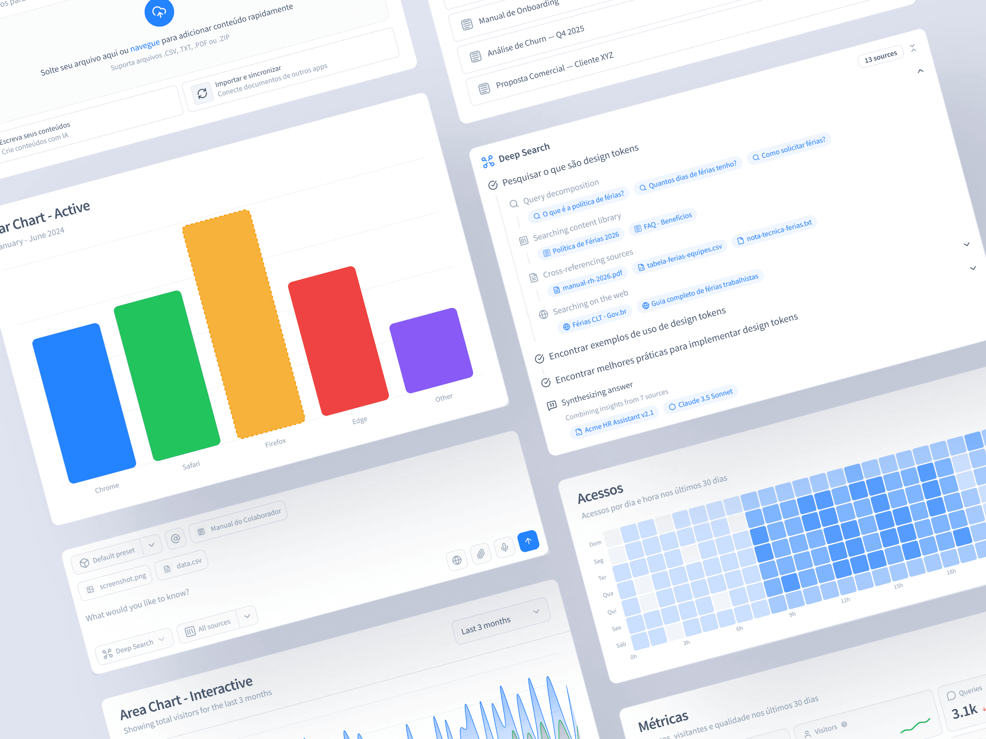
A design system for a B2B AI platform, in production for five years. I rebuilt a fragmented, hardcoded UI into a token-based library the product and engineering teams consume every day.
Context
The interface had grown by patching. Most components were hardcoded, styles
were copy-pasted between them, and the same element looked and behaved
differently from one screen to the next. There was no token layer and no
shared component contract, so every new state meant duplicating CSS and
adding another one-off prop. The legacy layer carried around eighty
components built this way, each with its own variant logic (one used
variant, another category, another size), so nothing composed and
nothing was predictable.
Role
I owned the design system end to end. Architecture, token layer, component contract, and documentation, all built in code, alongside the product and engineering teams that consume it daily. Sole design owner, from the first token to a library of around sixty components in daily production.
Process
I rebuilt the system from the foundations up, in code, without stopping the product.
- Built on shadcn, then extended. I imported the components into the project and went further, adapting and updating them, adding functionality and subcomponents, and building new primitives, instead of consuming a closed library.
- A token layer first. Around two hundred tokens, primitive color palettes plus a semantic layer (primary, secondary, success, warning, destructive, surfaces, borders), with typography, spacing and radius scales. Color lives in CSS variables, so the same component carries light and dark without branching.
- A single component contract. Every new component exposes its options through one declarative variant API instead of hand-written conditional classes, so a badge can vary by intent, radius and shape at once without duplicating styles.
- Accessible primitives underneath. The interactive components compose headless primitives, so keyboard and ARIA behavior is correct by default rather than reimplemented per component.
- Migration by reuse, not rewrite-everything. I moved the foundational, highest-reuse components first (input, button, badge), then the overlays, then the data components, replacing the legacy ones as the product adopted them.
Outcome
- In production for five years, consumed daily by the product and engineering teams.
- Around sixty components rebuilt on the new foundation, replacing the hardcoded legacy layer as they're adopted.
- Documented in Storybook with 200+ stories and visual regression, so a change is reviewed before it ships.
- Light and dark from the same tokens, with the design decisions written down instead of living in people's heads.
Component architecture
The system is organized in layers, from the most generic block to the most composed.
- Primitives. The base blocks, use-case agnostic (button, input, badge, and the layout ones). They carry the tokens and know nothing about the product.
- Semantic. Primitives with intent. Their API speaks in meaning (intent, status, surface), wired to the semantic token layer instead of raw values.
- Shared. Components reused across features, still use-case agnostic, that keep the product consistent.
- Featured. Components tied to a specific product feature, already aware of its data and context.
- Shell. The layer that composes features into the app frame, navigation, routes and layout. The DocView lives here, the panels that display the product's items, with drag-and-drop to reorder them and detail panels that open over an item.
Documentation, for people and machines
The system ships two layers of documentation. Storybook is the audit surface, every component and every state with visual regression, so a change is reviewed before it ships. Fumadocs is the reference the team reads, the usage rules and the reasoning, written to be understood rather than browsed.
The documentation is written for people and for machines. It is structured so an AI agent can consume it and help a developer assemble screens from the system instead of from scratch. That cuts the time to build a screen, the tokens spent getting there, and the rework that comes from guessing. Well-organized documentation is the whole mechanism.
UI and AI components
The library is not only UI primitives. It ships AI components too, the building blocks the product's AI features run on, chat, prompt input, chain-of-thought, artifacts, citations. The system covers the surface a conversational, RAG-based product actually needs.
Reflection
Three things proved decisive. Migrating by reuse instead of rewriting everything is what let the system replace the legacy layer without ever stopping the product. The slower path was the only one that shipped. Treating documentation as part of the product, not an afterthought, is what made it get adopted. The components mattered less than the fact that people, and now AI, could find the reasoning behind them. And structuring the components in layers, from primitive to shell, was the newest part for me and the one that gave the system its order.
Tags
Design System · AI · Product
Projects
Selected case studies focused on Design Systems and AI-native interfaces.
Controlled Generative UI
A B2B analytics product answers in natural language with visual artifacts. The AI picks from pre-built design-system components; the frontend renders real components, auditable by default, never runtime code.